Contents
About
ILINX eForms, a key component of ILINX Capture and the ILINX ECM Platform, enables you to easily capture accurate information from a desktop, laptop, tablet or smart phone.
This guide contains information on how to configure the ILINX eForms, Administrator tools and options.
Note: This guide assumes that installation of the ILINX Capture product has taken place. For complete installation documentation, please see the ILINX Installation Guide.
Access
It is a recommended best practice to create a dedicated user account for your ILINX eForms service to run on. The type of account, either domain or local, should be dictated by your corporate security guidelines. This account will allow you to grant read and write privileges to the service so that it can deliver metadata and/or content to the file system and maintain a working directory.
System Requirements
For general information on supported and recommended hardware, OS, web browsers, databases etc. for ILINX products, please see document titled: “ILINX Support Matrix.”
Configuration
Before configuring a new form within ILINX eForms, you must first create a Batch Profile within ILINX Capture. As part of configuring the Batch Profile, you much add all of the index fields at the Batch index fields level. Doc type Index fields are not recognized when creating new forms.
Note: For information to create new Batch Profiles and index fields within ILINX Capture, please refer to the ILINX Capture Administrators Guide.
While adding the batch index fields you may want to add database lookups as a part of your configuration and business process. Database lookups are compatible with the following datatypes only.
|
ILINX Capture
|
ILINX eForms
|
|---|---|
| Text | Text |
| Date | Date |
| Integer | Number |
| Decimal | Amount |
| Checkbox | CheckBox |
| Picklist | DropDown |
| Table | Table |
Configure the lookups with the ILINX Capture Batch Profile. Within ILINX eForms Form Builder, map the index field by selecting the appropriate index field from the ILINX Capture Batch Field dropdown.
Enable eForms
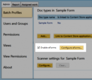
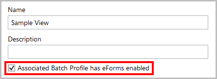
Prior to creating your new eForm, you must first create a Doc type and a basic Workflow within a Batch Profile. In your new Batch Profile, add a check mark next to Enable eForms.
Note: Save your Batch Profile prior to configuring eForms.
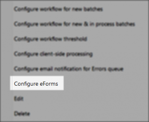
After saving you can either click the Configure eForms button located in the Batch Profile Edit screen or right click on the Batch Profile in the main window and select Configure eForms from the context menu. This will open the eForms form builder.
Form Manager
Once the ‘Configure eForms’ button is selected, the Form Manager tab will open for the Batch Profile. There are a number of options available prior to building your new form.
Screen Elements:
> New – The New button will open the Form Build screen where you will add the desired fields and create the layout of your form.
> Edit – Once a form is created, to make any changes later, select the Edit button.
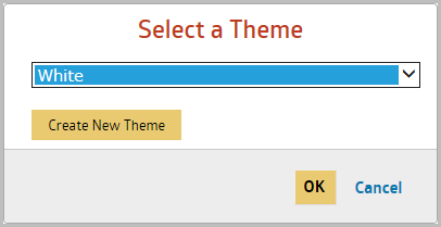
> Theme – ILINX eForms provides a number of built in Themes for your form as well as the option to add your own theme. Clicking the Theme button will open a message box to select a build in theme from the dropdown list or create your own by selecting the Create New Theme The Theme Editor screen will open allowing you to make the necessary edits for your form.
> Notifications – Selecting this option will open the Notification Settings screen. ILINX eForms allows you to configure email notifications to be sent when a form is completed to send to a specific email address, to send a confirmation email to the User, and/or to send the data captured within the form to another website.
> URL Flex Link – Opens the URL settings screen where you can integrate your eForm using ILINX Flex with a private or authenticated website. This option also provides a number of different code options for embedding the code.
> Logic – Opens the Logic Builder settings where you can define conditions and actions for your form.
> Payment – ILINX eForms also allows your form to accept payments through a PayPal Standard Merchant.
> Disable – When selected a message box will open which allows you to enter the message you would like your Users to receive if attempting to use this form. When a form is disabled, the eForm name will be crossed out and the Disable button will change to Enable. Simply select the form and click Enable when you want to make the form available again.
> Delete – Selecting Delete will open a confirmation box to ensure you want to delete the selected form as well as all the data that was collected.
> Duplicate – The form selected will be duplicated, creating a copy of the form in it’s current state so you can use it as a template for another form.
Form Builder
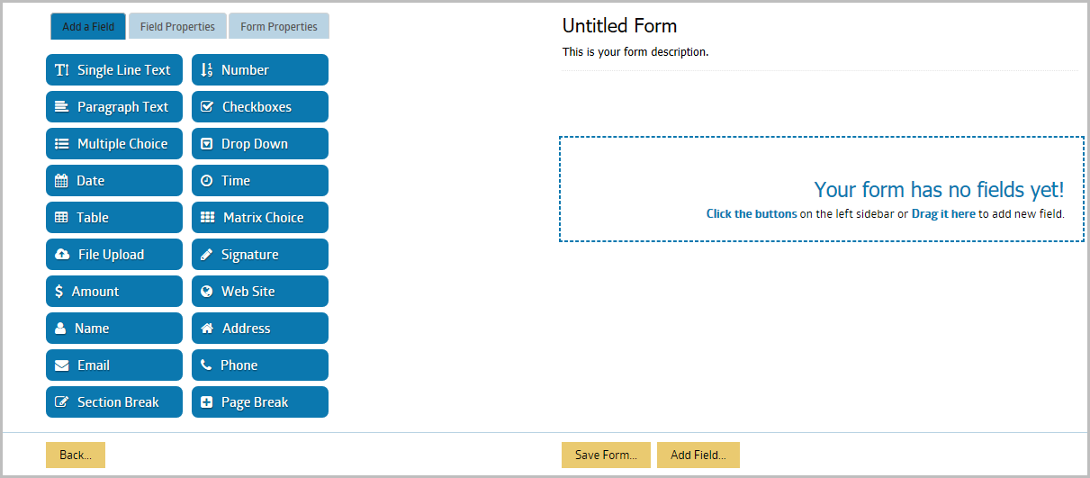
Clicking on the New button from the Form Manager will open the Form Builder screen. Once you save your new form, you can make edits using the Form Builder screen by selecting the Edit button.
The Form Builder is the place where you will spend most of the time when building a form. Here you will be able to add fields, set validations, set the form’s schedule and almost every aspect of your form’s functionality.
The Form Builder is divided into two main columns: The left column is the preview of your form, whereas the right column is the main interface where you can add fields, change field properties and change the properties of the form.
The preview section displays a preview of your form. However, the theme is not displayed within the preview. So if you are using any theme other than the default, you will be able to see the result on the live form only.
Adding Fields
To add fields to your form, click the field buttons on the right column of the Form Builder. You can also drag the field from the right column into the preview area of your form.
Ordering Fields
To move a field to any position on your form, simply click the field on your form preview area and drag it up or down to the desired position.
Field Properties
When you click a field on the form preview area, the field properties tab of that field will be displayed. Depending on the field type, the field properties tab will display any applicable setting for that particular field, including the label, rules, size, options, and guidelines, etc. You can click on the Help icon next to each option/property to access detailed information regarding the property.
Single Text Line
> ILINX Capture Batch Field – This field is used to associate the form field with an index field within the ILINX Capture Workflow. This is optional but must be used to capture any data that is being used within the Workflow or stored in a database.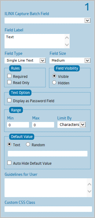
> Field Label – Field Label is one or two words placed directly above the field.
> Field Type – Field Type determines what kind of data can be collected by your field. After you save the form, the field type cannot be changed.
> Field Size – This property sets the visual appearance of the field in your form. It does not limit nor increase the amount of data that can be collected by the field.
> Rules:
– Required – Checking this rule will make sure that a user fills out a particular field. A message will be displayed to the user if they have not filled out the field.
– Read Only – If enabled, users won’t be able to change the value of this field.
> Field Visibility:
– Visible – This is the default option. The field will be accessible by anyone when the form is made public.
– Hidden – Field will not be shown to users when the form is made public. Useful to collect information that is not entered by the users (e.g. populated from URL parameters).
> Text Option:
– Display as Password Field – Checking this will display the field as a password field and masked all the characters (shown as asterisks or circles).
Please be aware that there is no encryption being made for the password field. You will be able to see it from the admin panel/email as a plain text.
> Range:
– Min – Enter the Minimum range number.
– Max – Enter the Maximum range number.
– Limit By – You can limit the amount of characters typed to be between certain characters or words, or between certain values in the case of number field. Leave the value blank or 0 if you don’t want to set any limit.
> Default Value:
– Text – The field will be prepopulated with the text you enter.
– Random – The field will be prepopulated with random letters, numbers or both.
– Auto Hide Default Value – As soon as the user types in the field, the default value will be automatically removed. Useful to provide short hint that describe the expected value of the field.
Tech terms: The default value will be used for the ‘placeholder’ attribute
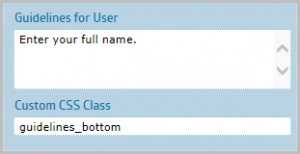
> Guidelines for User – This text will be displayed to your users while they’re filling out particular field.
> Custom CSS Class – This is an advanced option. You can add custom CSS classnames to the parent element of the field. This is useful if you would like to customize the styling for each of your field using your own CSS code. These custom class names will not appear live in the form builder, only on the live form.
Number
> ILINX Capture Batch Field – This field is used to associate the form field with an index field within the ILINX Capture Workflow. This is optional but must be used to capture any data that is being used within the Workflow or stored in a database.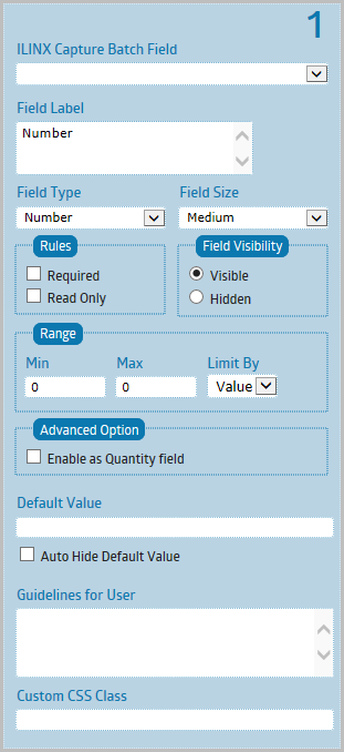
> Field Label – Field Label is one or two words placed directly above the field.
> Field Type – Field Type determines what kind of data can be collected by your field. After you save the form, the field type cannot be changed.
> Field Size – This property sets the visual appearance of the field in your form. It does not limit nor increase the amount of data that can be collected by the field.
> Rules:
– Required – Checking this rule will make sure that a user fills out a particular field. A message will be displayed to the user if they have not filled out the field.
– Read Only – If enabled, users won’t be able to change the value of this field.
> Field Visibility:
– Visible – This is the default option. The field will be accessible by anyone when the form is made public.
– Hidden – Field will not be shown to users when the form is made public. Useful to collect information that is not entered by the users (e.g. populated from URL parameters).
> Range:
– Min – Enter the Minimum range number.
– Max – Enter the Maximum range number.
– Limit By – You can limit the amount of characters typed to be between certain characters or words, or between certain values in the case of number field. Leave the value blank or 0 if you don’t want to set any limit.
> Advanced Option:
– Enable as Quantity field – Enable this option if your form has payment enabled and need to use quantity field to calculate the total price. Select the target field for the calculation from the dropdown list. Target field type must be one of the following: Multiple Choice, Drop Down, Checkboxes, Price.
> Default Value – By setting this value, the field will be prepopulated with the text you enter.
> Auto Hide Default Value – As soon as the user types in the field, the default value will be automatically removed. Useful to provide short hint that describe the expected value of the field.
Tech terms: The default value will be used for the ‘placeholder’ attribute.
> Guidelines for User – This text will be displayed to your users while they’re filling out particular field.
> Custom CSS Class – This is an advanced option. You can add custom CSS classnames to the parent element of the field. This is useful if you would like to customize the styling for each of your field using your own CSS code. These custom class names will not appear live in the form builder, only on the live form.
Paragraph Text
> ILINX Capture Batch Field – This field is used to associate the form field with an index field within the ILINX Capture Workflow. This is optional but must be used to capture any data that is being used within the Workflow or stored in a database.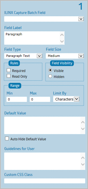
– Field Label – Field Label is one or two words placed directly above the field.
– Field Type – Field Type determines what kind of data can be collected by your field. After you save the form, the field type cannot be changed.
– Field Size – This property sets the visual appearance of the field in your form. It does not limit nor increase the amount of data that can be collected by the field.
> Rules:
– Required – Checking this rule will make sure that a user fills out a particular field. A message will be displayed to the user if they have not filled out the field.
– Read Only – If enabled, users won’t be able to change the value of this field.
> Field Visibility:
– Visible – This is the default option. The field will be accessible by anyone when the form is made public.
– Hidden – Field will not be shown to users when the form is made public. Useful to collect information that is not entered by the users (e.g. populated from URL parameters).
> Range:
– Min – Enter the Minimum range number.
– Max – Enter the Maximum range number.
– Limit By – You can limit the amount of characters typed to be between certain characters or words, or between certain values in the case of number field. Leave the value blank or 0 if you don’t want to set any limit.
> Default Value – By setting this value, the field will be prepopulated with the text you enter.
> Auto Hide Default Value – As soon as the user types in the field, the default value will be automatically removed. Useful to provide short hint that describe the expected value of the field.
Tech terms: The default value will be used for the ‘placeholder’ attribute.
> Guidelines for User – This text will be displayed to your users while they’re filling out particular field.
> Custom CSS Class – This is an advanced option. You can add custom CSS classnames to the parent element of the field. This is useful if you would like to customize the styling for each of your field using your own CSS code. These custom class names will not appear live in the form builder, only on the live form.
Checkboxes
> ILINX Capture Batch Field – This field is used to associate the form field with an index field within the ILINX Capture Workflow. This is optional but must be used to capture any data that is being used within the Workflow or stored in a database.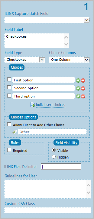
> Field Label – Field Label is one or two words placed directly above the field.
> Field Type – Field Type determines what kind of data can be collected by your field. After you save the form, the field type cannot be changed.
> Choice Columns – Set the number of columns being used to display the choices. Inline columns means the choices are sitting next to each other.
> Choices – Use the plus and minus buttons to add and delete choices. Click on the choice to make it the default selection.
> Choices Options:
– Allow Client to Add Other Choices – Enable this option if you would like to allow your client to write his own answer if none of the other choices are applicable. A text field will be added to the last choice. Enter the label below this checkbox.
> Rules:
– Required – Checking this rule will make sure that a user fills out a particular field. A message will be displayed to the user if they have not filled out the field.
> Field Visibility:
– Visible – This is the default option. The field will be accessible by anyone when the form is made public.
– Hidden – Field will not be shown to users when the form is made public. Useful to collect information that is not entered by the users (e.g. populated from URL parameters).
> ILINX Field Delimiter – The field delimiter is used when more than one option is selected and the metadata is mapped to a single ILINX Capture Batch Field. Enter a unique delimiter character so that the data may be separated later in the workflow if desired.
Note: Default is a pipe ‘|’ character.
> Guidelines for User – This text will be displayed to your users while they’re filling out particular field.
> Custom CSS Class – This is an advanced option. You can add custom CSS classnames to the parent element of the field. This is useful if you would like to customize the styling for each of your field using your own CSS code. These custom class names will not appear live in the form builder, only on the live form.
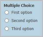
Multiple Choice
> ILINX Capture Batch Field – This field is used to associate the form field with an index field within the ILINX Capture Workflow. This is optional but must be used to capture any data that is being used within the Workflow or stored in a database.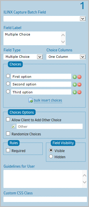
> Field Label – Field Label is one or two words placed directly above the field.
> Field Type – Field Type determines what kind of data can be collected by your field. After you save the form, the field type cannot be changed.
> Choice Columns – Set the number of columns being used to display the choices. Inline columns means the choices are sitting next to each other.
> Choices – Use the plus and minus buttons to add and delete choices. Click on the choice to make it the default selection.
> Choices Options:
– Allow Client to Add Other Choices – Enable this option if you would like to allow your client to write his own answer if none of the other choices are applicable. A text field will be added to the last choice. Enter the label below this checkbox.
– Randomize Choices – Enable this option if you would like the choices to be shuffled around each time the form being displayed.
> Rules:
– Required – Checking this rule will make sure that a user fills out a particular field. A message will be displayed to the user if they have not filled out the field.
> Field Visibility:
– Visible – This is the default option. The field will be accessible by anyone when the form is made public.
– Hidden – Field will not be shown to users when the form is made public. Useful to collect information that is not entered by the users (e.g. populated from URL parameters).
> Guidelines for User – This text will be displayed to your users while they’re filling out particular field.
> Custom CSS Class – This is an advanced option. You can add custom CSS classnames to the parent element of the field. This is useful if you would like to customize the styling for each of your field using your own CSS code. These custom class names will not appear live in the form builder, only on the live form.
Drop Down
> ILINX Capture Batch Field – This field is used to associate the form field with an index field within the ILINX Capture Workflow. This is optional but must be used to capture any data that is being used within the Workflow or stored in a database.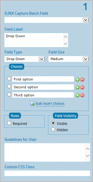
> Field Label – Field Label is one or two words placed directly above the field.
> Field Type – Field Type determines what kind of data can be collected by your field. After you save the form, the field type cannot be changed.
> Field Size – This property sets the visual appearance of the field in your form. It does not limit nor increase the amount of data that can be collected by the field.
> Choices – Use the plus and minus buttons to add and delete choices. Click on the choice to make it the default selection.
> Rules:
– Required – Checking this rule will make sure that a user fills out a particular field. A message will be displayed to the user if they have not filled out the field.
> Field Visibility:
– Visible – This is the default option. The field will be accessible by anyone when the form is made public.
– Hidden – Field will not be shown to users when the form is made public. Useful to collect information that is not entered by the users (e.g. populated from URL parameters).
> Guidelines for User – This text will be displayed to your users while they’re filling out particular field.
> Custom CSS Class – This is an advanced option. You can add custom CSS classnames to the parent element of the field. This is useful if you would like to customize the styling for each of your field using your own CSS code. These custom class names will not appear live in the form builder, only on the live form.
Date
> ILINX Capture Batch Field – This field is used to associate the form field with an index field within the ILINX Capture Workflow. This is optional but must be used to capture any data that is being used within the Workflow or stored in a database.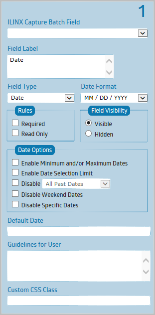
> Field Label – Field Label is one or two words placed directly above the field.
> Field Type – Field Type determines what kind of data can be collected by your field. After you save the form, the field type cannot be changed.
> Date Format – You can choose between American and European Date Formats.
> Rules:
– Required – Checking this rule will make sure that a user fills out a particular field. A message will be displayed to the user if they have not filled out the field.
– Read Only – If enabled, users won’t be able to change the value of this field.
> Field Visibility:
– Visible – This is the default option. The field will be accessible by anyone when the form is made public.
– Hidden – Field will not be shown to users when the form is made public. Useful to collect information that is not entered by the users (e.g. populated from URL parameters).
> Date Options:
– Enable Minimum and/or Maximum Dates – You can set minimum and/or maximum dates within which a date may be chosen.
– Enable Date Selection Limit – This is useful for reservation or booking form, so that you could allocate each day for a maximum number of customers. For example, setting the value to 5 will ensure that the same date can’t be booked/selected by more than 5 customers.
– Disable – Checking this option will disable either past or future date selection.
– Disable Weekend Dates – Checking this option will disable all weekend dates.
– Disable Specific Dates – You can disable any specific dates to prevent them from being selected by your clients. Use the datepicker to disable multiple dates.
> Default Date – Use the format ##/##/#### or any English date words, such as ‘today’, ‘tomorrow’, ‘last Friday’, ‘+1 week’, ‘last day of next month’, ‘3 days ago’, ‘Monday next week’.
> Guidelines for User – This text will be displayed to your users while they’re filling out particular field.
> Custom CSS Class – This is an advanced option. You can add custom CSS classnames to the parent element of the field. This is useful if you would like to customize the styling for each of your field using your own CSS code. These custom class names will not appear live in the form builder, only on the live form.
Time
> ILINX Capture Batch Field – This field is used to associate the form field with an index field within the ILINX Capture Workflow. This is optional but must be used to capture any data that is being used within the Workflow or stored in a database.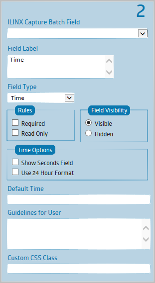
> Field Label – Field Label is one or two words placed directly above the field.
> Field Type – Field Type determines what kind of data can be collected by your field. After you save the form, the field type cannot be changed.
> Rules:
– Required – Checking this rule will make sure that a user fills out a particular field. A message will be displayed to the user if they have not filled out the field.
– Read Only – If enabled, users won’t be able to change the value of this field.
> Field Visibility:
– Visible – This is the default option. The field will be accessible by anyone when the form is made public.
– Hidden – Field will not be shown to users when the form is made public. Useful to collect information that is not entered by the users (e.g. populated from URL parameters).
> Time Options:
– Show Seconds Field – Checking this will enable Seconds field on your time field.
– Use 24 Hour Format – This will enable 24-hour notation in the form hh:mm (for example 14:23) or hh:mm:ss (for example, 14:23:45).
> Default Time – Example values: ‘now’, ‘+5 minute’, ‘+2 hour’, ‘-10 minute’, ‘+2 hour 30 minute’.
> Guidelines for User – This text will be displayed to your users while they’re filling out particular field.
> Custom CSS Class – This is an advanced option. You can add custom CSS classnames to the parent element of the field. This is useful if you would like to customize the styling for each of your field using your own CSS code. These custom class names will not appear live in the form builder, only on the live form.
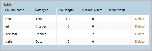
Table
> ILINX Capture Batch Field – This field is used to associate the form field with an index field within the ILINX Capture Workflow. This is optional but must be used to capture any data that is being used within the Workflow or stored in a database.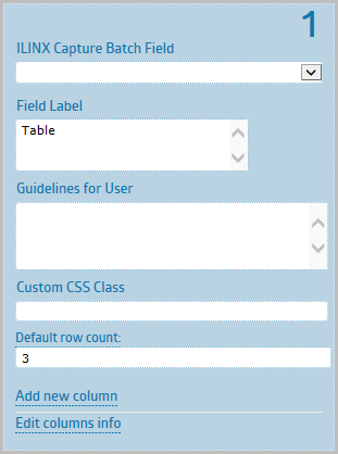
> Field Label – Field Label is one or two words placed directly above the field.
> Guidelines for User – This text will be displayed to your users while they’re filling out particular field.
> Custom CSS Class – This is an advanced option. You can add custom CSS classnames to the parent element of the field. This is useful if you would like to customize the styling for each of your field using your own CSS code. These custom class names will not appear live in the form builder, only on the live form.
> Default row count – The number entered here is the default number of rows that will be displayed to the user. The user may add or remove rows within the form.
Note: Default is 3 rows.
> New column info: The fields below may vary depending on the data type selected. Fill in the desired fields and select Add at the bottom of that section to add the new column.
– Column Name – The name that will be displayed at the top of the column.
– Data Type – Select either Text, Integer, Decimal, Date, or Checkbox as the data type for the new field.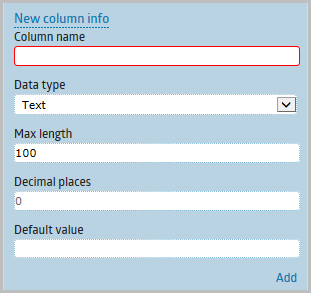
– Max length – Enter the maximum length of the field.
– Decimal places – When Decimal data type is selected, enter the number of decimal places that is allowed for this field.
– Default value – Enter the default value that will be displayed when the user opens the form. Leave blank for no defaults.
– Add button – Select the Add option at the bottom of the New Column Info section to add the new column to the Table.
> Edit Column Info: The fields below may vary depending on the data type of the column that is selected. Update the desired fields and select Update at the bottom of that section.
– Select column name – Select the column name from the drop down box that you want to update.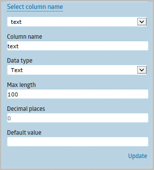
– Column name – The name that will be displayed at the top of the column.
– Data Type – Select either Text, Integer, Decimal, Date, or Checkbox as the data type for the new field.
– Max length – Enter the maximum length of the field.
– Decimal places – When Decimal data type is selected, enter the number of decimal places that is allowed for this field.
– Default value – Enter the default value that will be displayed when the user opens the form. Leave blank for no defaults.
– Update button – Select the Update option at the bottom of the Edit Column Info section to update the column selected in the Table.
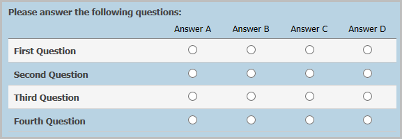
Matrix Choice
> ILINX Capture Batch Field – This field is used to associate the form field with an index field within the ILINX Capture Workflow. This is optional but must be used to capture any data that is being used within the Workflow or stored in a database.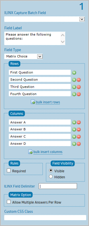
> Field Label – Field Label is one or two words placed directly above the field.
> Field Type – Field Type determines what kind of data can be collected by your field. After you save the form, the field type cannot be changed.
> Rows – Enter rows labels here. Use the plus and minus buttons to add and delete matrix row.
> Columns – Enter column labels here. Use the plus and minus buttons to add and delete matrix column.
> Rules:
– Required – Checking this rule will make sure that a user fills out a particular field. A message will be displayed to the user if they have not filled out the field.
> Field Visibility:
– Visible – This is the default option. The field will be accessible by anyone when the form is made public.
– Hidden – Field will not be shown to users when the form is made public. Useful to collect information that is not entered by the users (e.g. populated from URL parameters).
> ILINX Field Delimiter – The field delimiter is used when more than one option is selected and the metadata is mapped to a single ILINX Capture Batch Field. Enter a unique delimiter character so that the data may be separated later in the workflow if desired.
Note: Default is a pipe ‘|’ character.
> Matrix Option:
– Allow Multiple Answers Per Row – Checking this option will allow your client to select multiple answers for each row. This option can only being set once, when you initially added the matrix field. Once you have saved the form, this option can’t be changed.
> Custom CSS Class – This is an advanced option. You can add custom CSS classnames to the parent element of the field. This is useful if you would like to customize the styling for each of your field using your own CSS code. These custom class names will not appear live in the form builder, only on the live form.
File Upload
> ILINX Capture Batch Field – This field is used to associate the form field with an index field within the ILINX Capture Workflow. This is optional but must be used to capture any data that is being used within the Workflow or stored in a database.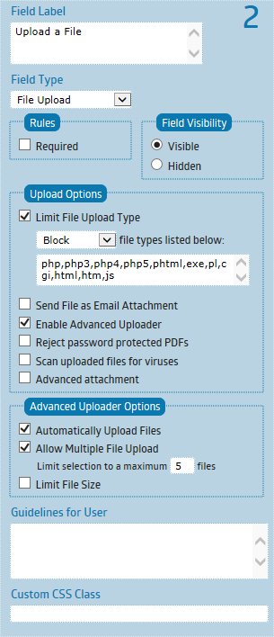
> Field Label – Field Label is one or two words placed directly above the field.
> Field Type – Field Type determines what kind of data can be collected by your field. After you save the form, the field type cannot be changed.
> Rules:
– Required – Checking this rule will make sure that a user fills out a particular field. A message will be displayed to the user if they have not filled out the field.
> Field Visibility:
– Visible – This is the default option. The field will be accessible by anyone when the form is made public.
– Hidden – Field will not be shown to users when the form is made public. Useful to collect information that is not entered by the users (e.g. populated from URL parameters).
> Upload Options:
– Limit File Upload Type – You can block or only allow certain file types to be uploaded. Enter the file types extension into the textbox, separate them with commas. (example: jpg,gif,png,bmp).
– Send File as Email Attachment – By default, all file uploads will be sent to your email as a download link. Checking this option will send the file as email attachment instead. WARNING: Don’t enable this option if you expect to receive large files from your clients. If the files attached are larger than the allowed memory limit on your server, the email won’t be sent.
– Enable Advanced Uploader – Checking this option will enable advanced functionality, such as Upload Progress Bar, Multiple File Uploads, AJAX uploads, File Size Limit, etc. This option is recommended to be enabled.
– Reject password protected PDFs – Select this option to check to validate the submitted PDF is not protected by a password.
– Scan uploaded files for viruses – Allows for a basic virus scan to take place on all files being uploaded.
This option can use any antivirus software that has command-line versions. To override the default virus scanning tool, add the three keys indicated below with the appropriate configuration values for the desired antivirus software to the eForms web.config file. This file is located in the ILINX eForms & Flex Program Files folder. The example below should be added for Windows Defender antivirus software:
<add key=”VirusScanProc” value=”C:\Program Files\Windows Defender\MpCmdRun.exe”/>
<add key=”VirusScanArgs” value=”-scan -scantype 3 -file {0}”/>
<add key=”VirusScanSuccessMsg” value=”found no threats”/>
Note: If this option is enabled, all scanning occurs prior all other processing through ILINX eForms.
– Advanced attachment – Selecting this option will enable the user to enter index data into the DocType index fields that are associated with form. The user is prompted to enter the metadata after the file is uploaded prior to submitting.
> Advanced Uploader Options:
– Automatically Upload Files – By default, the upload button or the form submit button need to be clicked to start uploading the file. By checking this option, the file will be automatically being uploaded as soon as the file being selected.
– Allow Multiple File Upload – Checking this option will allow multiple files to be uploaded. You can also limit the maximum number of files to be uploaded.
– Limit File Size – You can set the maximum size of a file allowed to be uploaded here.
> Guidelines for User – This text will be displayed to your users while they’re filling out particular field.
> Custom CSS Class – This is an advanced option. You can add custom CSS classnames to the parent element of the field. This is useful if you would like to customize the styling for each of your field using your own CSS code. These custom class names will not appear live in the form builder, only on the live form.
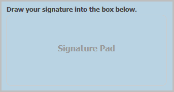
Signature
> ILINX Capture Batch Field – This field is used to associate the form field with an index field within the ILINX Capture Workflow. This is optional but must be used to capture any data that is being used within the Workflow or stored in a database.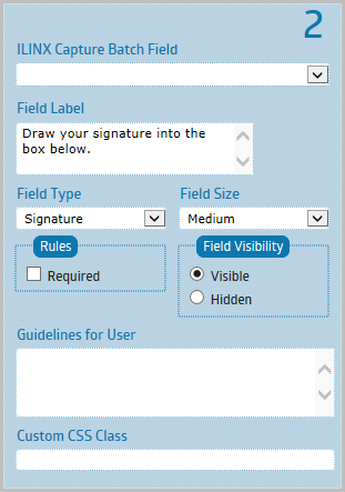
> Field Label – Field Label is one or two words placed directly above the field.
> Field Type – Field Type determines what kind of data can be collected by your field. After you save the form, the field type cannot be changed.
> Field Size – This property sets the visual appearance of the field in your form. It does not limit nor increase the amount of data that can be collected by the field.
> Rules:
– Required – Checking this rule will make sure that a user fills out a particular field. A message will be displayed to the user if they have not filled out the field.
> Field Visibility:
– Visible – This is the default option. The field will be accessible by anyone when the form is made public.
– Hidden – Field will not be shown to users when the form is made public. Useful to collect information that is not entered by the users (e.g. populated from URL parameters).
> Guidelines for User – This text will be displayed to your users while they’re filling out particular field.
> Custom CSS Class – This is an advanced option. You can add custom CSS classnames to the parent element of the field. This is useful if you would like to customize the styling for each of your field using your own CSS code. These custom class names will not appear live in the form builder, only on the live form.
Amount
> ILINX Capture Batch Field – This field is used to associate the form field with an index field within the ILINX Capture Workflow. This is optional but must be used to capture any data that is being used within the Workflow or stored in a database.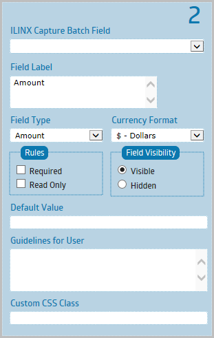
> Field Label – Field Label is one or two words placed directly above the field.
> Field Type – Field Type determines what kind of data can be collected by your field. After you save the form, the field type cannot be changed.
> Currency Format – Select the currency format desired based on the type of currency (ie. Dollars, Euros, Pounds Sterling, etc.).
> Rules:
– Required – Checking this rule will make sure that a user fills out a particular field. A message will be displayed to the user if they have not filled out the field.
– Read Only – If enabled, users won’t be able to change the value of this field.
> Field Visibility:
– Visible – This is the default option. The field will be accessible by anyone when the form is made public.
– Hidden – Field will not be shown to users when the form is made public. Useful to collect information that is not entered by the users (e.g. populated from URL parameters).
> Default Value – By setting this value, the field will be prepopulated with the text you enter.
> Guidelines for User – This text will be displayed to your users while they’re filling out particular field.
> Custom CSS Class – This is an advanced option. You can add custom CSS classnames to the parent element of the field. This is useful if you would like to customize the styling for each of your field using your own CSS code. These custom class names will not appear live in the form builder, only on the live form.
Web Site
> ILINX Capture Batch Field – This field is used to associate the form field with an index field within the ILINX Capture Workflow. This is optional but must be used to capture any data that is being used within the Workflow or stored in a database.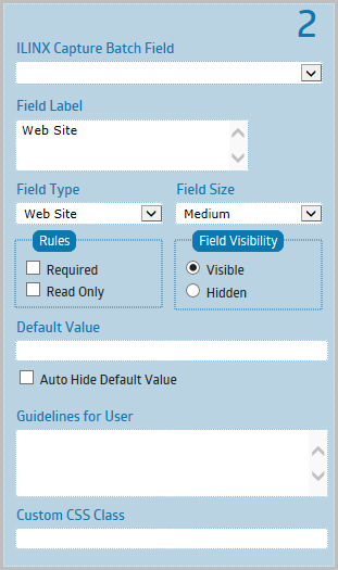
> Field Label – Field Label is one or two words placed directly above the field.
> Field Type – Field Type determines what kind of data can be collected by your field. After you save the form, the field type cannot be changed.
> Field Size – This property sets the visual appearance of the field in your form. It does not limit nor increase the amount of data that can be collected by the field.
> Rules:
– Required – Checking this rule will make sure that a user fills out a particular field. A message will be displayed to the user if they have not filled out the field.
– Read Only – If enabled, users won’t be able to change the value of this field.
> Field Visibility:
– Visible – This is the default option. The field will be accessible by anyone when the form is made public.
– Hidden – Field will not be shown to users when the form is made public. Useful to collect information that is not entered by the users (e.g. populated from URL parameters).
> Default Value – By setting this value, the field will be prepopulated with the text you enter.
> Auto Hide Default Value – As soon as the user types in the field, the default value will be automatically removed. Useful to provide short hint that describe the expected value of the field.
Tech terms: The default value will be used for the ‘placeholder’ attribute.
> Guidelines for User – This text will be displayed to your users while they’re filling out particular field.
> Custom CSS Class – This is an advanced option. You can add custom CSS classnames to the parent element of the field. This is useful if you would like to customize the styling for each of your field using your own CSS code. These custom class names will not appear live in the form builder, only on the live form.
Name
> ILINX Capture Batch Field – This field is used to associate the form field with an index field within the ILINX Capture Workflow. This is optional but must be used to capture any data that is being used within the Workflow or stored in a database.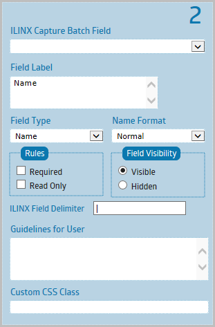
> Field Label – Field Label is one or two words placed directly above the field.
> Field Type – Field Type determines what kind of data can be collected by your field. After you save the form, the field type cannot be changed.
> Name Format – Two formats available. A normal name field, or an extended name field with title and suffix.
> Rules:
– Required – Checking this rule will make sure that a user fills out a particular field. A message will be displayed to the user if they have not filled out the field.
– Read Only – If enabled, users won’t be able to change the value of this field.
> Field Visibility:
– Visible – This is the default option. The field will be accessible by anyone when the form is made public.
– Hidden – Field will not be shown to users when the form is made public. Useful to collect information that is not entered by the users (e.g. populated from URL parameters).
> ILINX Field Delimiter – The field delimiter is used when more than one option is selected and the metadata is mapped to a single ILINX Capture Batch Field. Enter a unique delimiter character so that the data may be separated later in the workflow if desired.
Note: Default is a pipe ‘|’ character.
> Guidelines for User – This text will be displayed to your users while they’re filling out particular field.
> Custom CSS Class – This is an advanced option. You can add custom CSS classnames to the parent element of the field. This is useful if you would like to customize the styling for each of your field using your own CSS code. These custom class names will not appear live in the form builder, only on the live form.
Address
> ILINX Capture Batch Field – This field is used to associate the form field with an index field within the ILINX Capture Workflow. This is optional but must be used to capture any data that is being used within the Workflow or stored in a database.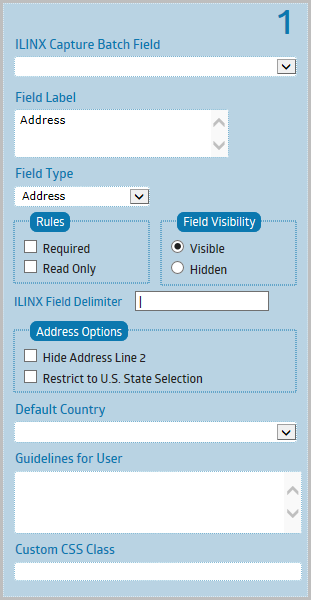
> Field Label – Field Label is one or two words placed directly above the field.
> Field Type – Field Type determines what kind of data can be collected by your field. After you save the form, the field type cannot be changed.
> Rules:
– Required – Checking this rule will make sure that a user fills out a particular field. A message will be displayed to the user if they have not filled out the field.
– Read Only – If enabled, users won’t be able to change the value of this field.
> Field Visibility:
– Visible – This is the default option. The field will be accessible by anyone when the form is made public.
– Hidden – Field will not be shown to users when the form is made public. Useful to collect information that is not entered by the users (e.g. populated from URL parameters).
> ILINX Field Delimiter – The field delimiter is used when more than one option is selected and the metadata is mapped to a single ILINX Capture Batch Field. Enter a unique delimiter character so that the data may be separated later in the workflow if desired.
Note: Default is a pipe ‘|’ character.
> Address Options:
– Hide Address Line 2 – Hide the ‘Address Line 2’ field from the address field.
– Restrict to U.S. State Selection – Checking this will limit the country selection to United States only and the state field will be populated with U.S. state list.
> Default Country – By setting this value, the country field will be prepopulated with the selection you make.
> Guidelines for User – This text will be displayed to your users while they’re filling out particular field.
> Custom CSS Class – This is an advanced option. You can add custom CSS classnames to the parent element of the field. This is useful if you would like to customize the styling for each of your field using your own CSS code. These custom class names will not appear live in the form builder, only on the live form.
> ILINX Capture Batch Field – This field is used to associate the form field with an index field within the ILINX Capture Workflow. This is optional but must be used to capture any data that is being used within the Workflow or stored in a database.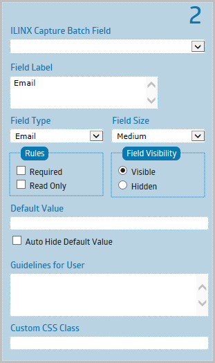
> Field Label – Field Label is one or two words placed directly above the field.
> Field Type – Field Type determines what kind of data can be collected by your field. After you save the form, the field type cannot be changed.
> Field Size – This property sets the visual appearance of the field in your form. It does not limit nor increase the amount of data that can be collected by the field.
> Rules:
– Required – Checking this rule will make sure that a user fills out a particular field. A message will be displayed to the user if they have not filled out the field.
– Read Only – If enabled, users won’t be able to change the value of this field.
> Field Visibility:
– Visible – This is the default option. The field will be accessible by anyone when the form is made public.
– Hidden – Field will not be shown to users when the form is made public. Useful to collect information that is not entered by the users (e.g. populated from URL parameters).
> Default Value – By setting this value, the field will be prepopulated with the text you enter.
> Auto Hide Default Value – As soon as the user types in the field, the default value will be automatically removed. Useful to provide short hint that describe the expected value of the field.
Tech terms: The default value will be used for the ‘placeholder’ attribute.
> Guidelines for User – This text will be displayed to your users while they’re filling out particular field.
> Custom CSS Class – This is an advanced option. You can add custom CSS classnames to the parent element of the field. This is useful if you would like to customize the styling for each of your field using your own CSS code. These custom class names will not appear live in the form builder, only on the live form.
Phone
> ILINX Capture Batch Field – This field is used to associate the form field with an index field within the ILINX Capture Workflow. This is optional but must be used to capture any data that is being used within the Workflow or stored in a database.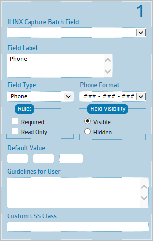
> Field Label – Field Label is one or two words placed directly above the field.
> Field Type – Field Type determines what kind of data can be collected by your field. After you save the form, the field type cannot be changed.
> Phone Format – You can choose between American and International Phone Formats.
> Rules:
– Required – Checking this rule will make sure that a user fills out a particular field. A message will be displayed to the user if they have not filled out the field.
– Read Only – If enabled, users won’t be able to change the value of this field.
> Field Visibility:
– Visible – This is the default option. The field will be accessible by anyone when the form is made public.
– Hidden – Field will not be shown to users when the form is made public. Useful to collect information that is not entered by the users (e.g. populated from URL parameters).
> Default Value – By setting this value, the field will be prepopulated with the text you enter.
> Guidelines for User – This text will be displayed to your users while they’re filling out particular field.
> Custom CSS Class – This is an advanced option. You can add custom CSS classnames to the parent element of the field. This is useful if you would like to customize the styling for each of your field using your own CSS code. These custom class names will not appear live in the form builder, only on the live form.
Section Break
> Field Label – Field Label is one or two words placed directly above the field.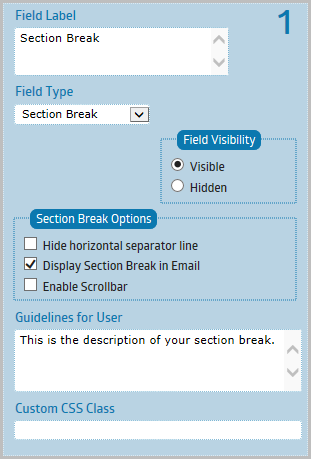
> Field Type – Field Type determines what kind of data can be collected by your field. After you save the form, the field type cannot be changed.
> Field Visibility:
– Visible – This is the default option. The field will be accessible by anyone when the form is made public.
– Hidden – Field will not be shown to users when the form is made public. Useful to collect information that is not entered by the users (e.g. populated from URL parameters).
> Section Break Options:
– Hide Horizontal Separator Line – Enable this option if you would like to hide the line separating the desired sections.
– Display Section Break in Email – Enable this option if you need to display the content of the section break within the notification email, review page and entries page.
– Enable Scrollbar – The section break will be set to a fixed height and a vertical scrollbar will be displayed as needed. This is useful to display large amount of text, such as terms and conditions, or contract agreement.
> Guidelines for User – This text will be displayed to your users while they’re filling out particular field.
> Custom CSS Class – This is an advanced option. You can add custom CSS classnames to the parent element of the field. This is useful if you would like to customize the styling for each of your field using your own CSS code. These custom class names will not appear live in the form builder, only on the live form.
Page Break
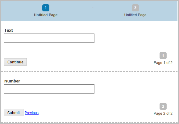
When you have a form with many fields, it’s a good practice to split your form into multiple pages to ensure that the length of your form won’t overwhelm your clients and cause them to abandon your form.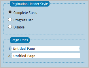
Creating a multi-page form is very simple within ILINX Capture. Simply drag a “Page Break” field into the form preview area and a new page will be created.
Important Note: When configuring your eForm with multiple pages, ONLY while completing the form initially will the form contain multiple pages. Once the eForm has been submitted into ILINX Capture and is opened using the Assigned Work tab or Assigned Views tab, it will be “flattened” and all pages will be combined into a single form presentation. This applies when using either XBAP or Flex viewing formats.
You can then drag/add fields into each page.
– Use Text Button – This is the default and recommended option. All buttons will use simple text. You can change the text being used on each page submit/back button.
– Use Image Button – Select this option if you prefer to use your own submit/back image buttons. Make sure to enter the full URL address to your images.
> Submit Button – Enter the text to display for the button to move to the next page.
> Back Button – Enter the text to display for the button to move to the previous page.
Form Properties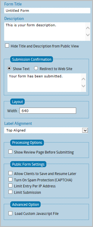
Similar to the field properties tab, the Form Properties controls almost any aspect of the form. You can change the form’s title, language, processing options, protection and limit, schedule, etc.
> Form Title – The title of your form displayed to the user when they see your form.
> Description – This will appear directly below the form name. Useful for displaying a short description or any instructions, notes, guidelines.
> Hide Title and Description from Public View – Selecting this option so that the Title and Description will be hidden.
> Submission Confirmation:
– Show Text – This message will be displayed after your users have successfully submitted an entry.
You can enter any HTML codes, Javascript codes or Merge Tags as well.
– Redirect to Web Site – After your users have successfully submitted an entry, you can redirect them to another website/URL of your choice.
You can insert Merge Tags into the URL to pass form data.
> Label Alignment – Set the field label placement. Ie. Top Aligned, Left Aligned, or Right Aligned.
> Processing Options:
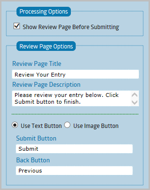
– Show Review Page Before Submitting – If enabled, your clients will be prompted to a preview page that lets them double check their entries before submitting the form.
– Review Page Options:
• Review Page Title – Enter the title to be displayed on the review page.
• Review Page Description – Enter some brief description to be displayed on the review page.
• Use Text Button – This is the default and recommended option. All buttons on review page will use simple text.
• Use Image Button – Select this option if you prefer to use your own submit/back image buttons. Make sure to enter the full URL address to your images.
> Protection & Limit:
– Allow Clients to Save and Resume Later – Checking this will display additional link at the bottom of your form which would allow your clients to save their progress and resume later. This option only available if your form has at least two pages (has one or more Page Break field).
• Resume Email Options: Resume Email Subject, Resume Email Content, From Name, From Email – You can insert merge tags and HTML codes into Resume Email Subject and Resume Email Content.
– Turn On Spam Protection (CAPTCHA) – If enabled, an image with random words will be generated and users will be required to enter the correct words in order to submit the form. This is useful to prevent abuse from bots or automated programs usually written to generate spam.
• Type – You can select the difficulty level of the spam protection.
» reCAPTCHA V2: Improved version of reCAPTCHA. Display an image with distorted words. An audio also included. This is the most secure but also the hardest to read. Some people might find this annoying. If you use this, you’ll need to fill your keys into the database AppSettings table.
» Simple Image: Display an image with a clear and sharp words. Most people will find this easy to read.
» Simple Text: Display a text (not an image) which contain simple question to solve.
– Limit Entry Per IP Address – Use this to prevent each client from filling out your form more than the allowed limit within a certain period. This is done by comparing client’s IP Address.
– Limit Submission – The form will be turned off after reaching the number of entries defined here.
• Automatic Scheduling:
» Enable Automatic Scheduling – If you would like to schedule your form to become active at certain period of time only, enable this option.
> Advanced Option:
– Load Custom Javascript File – You can register your own custom javascript file to run inline with the form. Your script will be loaded each time the form is being displayed.
Theme Editor
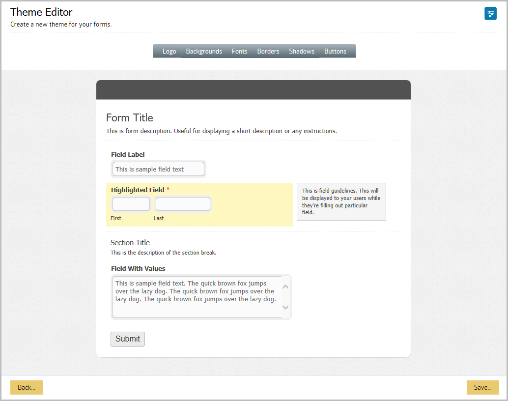
The Theme Editor allows you to visually adjust the look and feel of your form, such as the logo, fonts, backgrounds, and borders, etc. There are a number of generic built-in themes available to choose from. You may also develop your own by selecting the Create New Theme button. Selecting this button will open the Theme Editor.
The Theme Editor consists of two main areas. The top area is the style category buttons and the bottom area provides a preview of your form.
Clicking on any of the category buttons will display all related property buttons for that category. You can then click on each of the Edit buttons to display the properties tab.
Depending on the category, each property button will display different properties tabs, such as color picker, font selector, etc. When you change any of those settings, the result will be displayed instantly on the form preview area.
Theme Options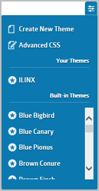
In the upper right of the screen, there is a Theme Options button. Click this button and you can choose to:
> Creating a New Theme – To create a new theme, select “Create New Theme” from the dropdown on the top right corner of the Theme Editor. This will clear any currently unsaved form configurations.
> Adding Custom CSS Code – There are times you will need to use custom CSS code to fine-tune your theme or perform specific tasks, which cannot be done with the Theme Editor (such as aligning a few fields into a single line).
The Theme Editor allows you to add any valid CSS code to your theme. On the Theme Editor, click the dropdown on the right top corner and select the “Advanced” menu. You will be prompted to enter your CSS code. Once you have finished, make sure to save your theme to apply any changes.
> Your Themes – Displayed is a list of themes that have been previously configured within eForms for you to choose from.
> Built-in Themes – This lists the same theme options that were available when first selecting Themes from the Form Manager screen.
Editing a Theme
To edit a theme, select the theme name from the dropdown. The preview of the selected theme will be displayed, and you can continue adjusting the theme using the property buttons.
Build and edit your theme by adjusting the properties as needed, and then click the Save button.
Using a Theme
Once you have created a theme, you can apply the theme to any form you want. To apply a theme to one particular form, go to the Form Manager and click the Theme icon. Select the theme you would like to use and click the Save button. Refresh your form to see the result. If the new theme has not being applied, delete your browser cache and then refresh your form again.
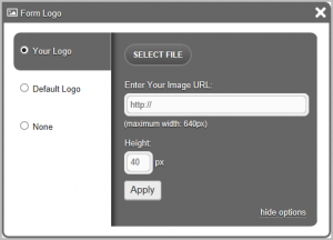
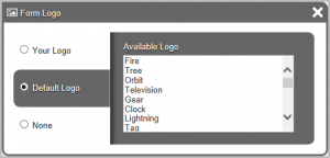
Logos
Select the Logo button. This will show an Edit button to the left of the screen where you may configure how you want your logo to be displayed. You may upload your own logo, Select a Default Logo, or decide to have no logo.
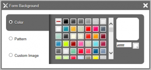
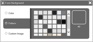
Backgrounds
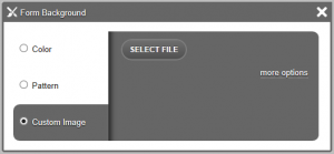
Select the Backgrounds button. This will show a number of Edit options where you can choose to change Wallpaper, Header Background, Form Background, Highlight Color, Guidelines Background, and Field Background. Clicking Edit on any these backgrounds will open the configurations for you to choose the Color, Pattern, or uploading a Custom Image.
Fonts
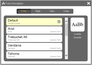
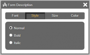
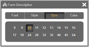
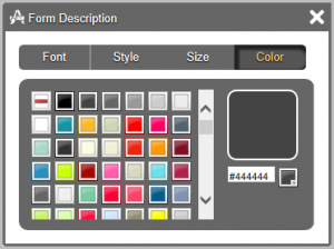
Select the Fonts button. This will show a number of Edit options where you can choose to change Form Title, Form Description, Field Label, Guidelines Text, Section Title, Section Break Description, and Field Values. Clicking Edit on any these Fonts will open the configurations for you to choose the Font, Style, Size or Color.
Borders
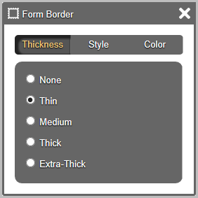
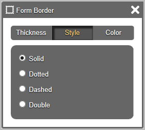
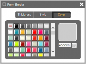
Select the Borders button. This will show a number of Edit options where you can choose to change Form Border, Guidelines Border, or Section Break Border. Clicking Edit on any these Borders will open the configurations for you to choose the Thickness, Style or Color.
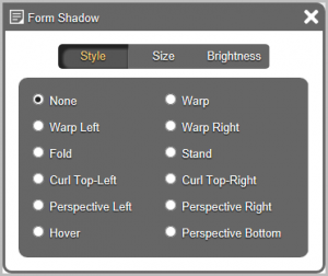
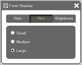
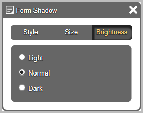
Shadows
Select the Shadows button. This will show one Edit option where you can choose to change the Form Shadow. Clicking Edit on this Shadow will open the configurations for you to choose the Style, Size, or Brightness.
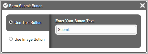
Buttons
Select the Buttons button. This will show one Edit option where you can choose to change the Form Submit Button. Clicking Edit on this Shadow will open the configurations for you to Enter Your Button Text or use an Image Button by entering an Image URL.
Notifications Settings
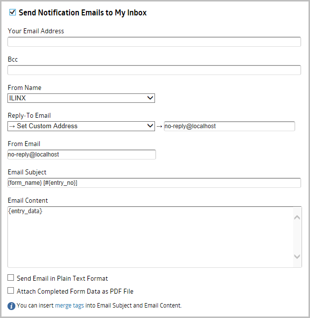
The email notification feature of ILINX eForms is very powerful. You can customize every aspect of it (sender, receiver, content template, and auto-responder). The email notification interface consists of three blocks of settings. The first block is the settings to send the email notifications to your inbox. The second block is the settings pane to send an auto-responder email to the users who fill out the form. The third block is the settings that enable sending the form data to another website.
Send Notification Emails to My Inbox
Enable this option to send all successful form submission to your email address (all the data will still be accessible from your ILINX admin panel as well).
Screen Elements
> Your Email Address – You can enter multiple email addresses. Simply separate them with commas.
> Bcc – Blind Carbon Copy Addresses. This is OPTIONAL. You can enter multiple email addresses, simply separate them with commas.
> From Name – If your form has ‘Name’ or ‘Single Line Text’ field type, it will be available here and you can choose it as the ‘From Name’ of the email. Or you can set your own custom ‘From Name’.
> Reply-To Email – If your form has ‘Email’ field type, it will be available here and you can choose it as the reply-to address. Or you can set your own custom reply-to address.
> From Email – To ensure delivery of your notification emails, we STRONGLY recommend to use email from the same domain as ILINX Capture is located. e.g. no-reply@ilinx.com.
> Email Subject – Enter the Subject that will be displayed in the received email. Merge Tag Lookups are allowed. Select the merge tags link at the bottom of the pane to show the tags available. The subject is fully customizable. You can use ‘template variables’ to insert form data in the subject.
> Email Content – The content of the notification are fully customizable. You can use ‘template variables’ to insert form data in the content. You can also use HTML code, along with CSS, to customize the email content.
> Send Email in Plain Text Format – Select this option to only send plain text emails.
> Attach Completed Form Data as PDF File – Enabling this option will include an attachment of the form in PDF format.
Send Confirmation Email to User
An auto-responder email is an email that is sent to the person who filled in the form after the form has been successfully submitted. Usually, the auto-responder is used to provide confirmation or receipt of the user’s submission. ILINX eForms auto-responder is also fully customizable, with the subject, content, and sender’s address -everything- able to be configured. You form must have at least one email field type. You can then select the email field you would like to send the auto-responder to.
Screen Elements
> User Email Address – Confirmation email will be sent to the email address being entered by the user to this field.
> Bcc – Blind Carbon Copy Addresses. This is OPTIONAL. You can enter multiple email addresses, simply separate them with commas.
> From Name – If your form has ‘Name’ or ‘Single Line Text’ field type, it will be available here and you can choose it as the ‘From Name’ of the email. Or you can set your own custom ‘From Name’.
> Reply-To Email – If your form has ‘Email’ field type, it will be available here and you can choose it as the reply-to address. Or you can set your own custom reply-to address.
> From Email – To ensure delivery of your notification emails, we STRONGLY recommend to use email from the same domain as ILINX Capture is located. e.g. no-reply@ilinx.com.
> Email Subject – Enter the Subject that will be displayed in the received email. Merge Tag Lookups are allowed. Select the merge tags link at the bottom of the pane to show the tags available. The subject is fully customizable. You can use ‘template variables’ to insert form data in the subject.
> Email Content – The content of the notification are fully customizable. You can use ‘template variables’ to insert form data in the content. You can also use HTML code, along with CSS, to customize the email content.
> Send Email in Plain Text Format – Select this option to only send plain text emails.
> Attach Completed Form Data as PDF File – Enabling this option will include an attachment of the form in PDF format.
Send Form Data to Another Website
This is ADVANCED option. You can enable this option to send form data to any other custom URL. Useful to integrate your form with many other web applications, such as Aweber, MailChimp, Salesforce, CampaignMonitor, etc.
Screen Elements
> Website URL – Enter the custom URL you want to send the form data to.
> HTTP Method – Choose HTTP POST, HTTP GET, or HTTP PUT.
> Use HTTP Authentication – Selecting this setting requires you to enter a User Name and Password.
> Use Custom HTTP Headers – Enabling this option opens a box to enter custom header formatting.
> Data Format – Select either Send Key-Value Pairs or Send Raw Data.
– Send Key – Value Pairs enables parameters to include the information to be added to the website. Additional Parameters may be added using the + at the bottom of the list.
• Name -> You can type any parameter name you prefer here.
• Value -> Should be the merge tag of the field you would like to send. Such as {element_1} or {element_2} etc. You can also enter any static value.
– Send Raw Data opens a multirow box to enter data as desired. Enter any content you would like to send here. You can use any data format (e.g. JSON, XML or raw text). Just make sure to set the proper ‘Content-Type’ HTTP header as well.
Form Links
ILINX eForms is designed to create forms that can be integrated easily with your website. Using the multiple embed code options, you will be able to use the form in your site using any method you are familiar with. The code manager displays multiple form codes that you can easily copy and paste into your web page.
Note: This client application supports a wide variety of web browsers running on either Windows or Mac, including Mozilla Firefox, Google Chrome, and Microsoft Internet Explorer.
Authenticated URL
The URL displayed is unique to the form that was selected when opening this screen. This URL will require the user to log into ILINX Capture to access the form. The user must have permissions to the form and ILINX Capture in order to access and to have data captured and processes through the workflow.
Public URL
Enabling this feature requires an ILINX Capture built-in user to authenticate. This will allow users to use the form through ILINX Flex or by embedding directly into a website using a variety of options.
Once a valid username and password are entered, select the Save button. This will expand the pane to allow you to select the desired Form Code Type.
By changing the ‘Form Code Type’ dropdown, different embed code options will be displayed to suit your needs. This code will insert the form into your existing web page seamlessly. Thus the form background, border and logo header won’t be displayed.
Choosing a Form Code Type
There are five embed codes you can choose to use in the form. These are Javascript Code, Iframe Code, Simple Link and Popup Link. Depending on your website and the CMS you are using, one embed code might prove to be better than the others.
Javascript Code
The Javascript Code is the recommended code to embed the form in your web page. Using this code, the form will blend seamlessly with your web page and most people won’t even notice it. Under the hood, the Javascript code basically displays your form inside an iframe. However, the Javascript is smart enough to expand the height of your iframe as needed.
As this code is intended to integrate the form into your existing web page seamlessly, the form’s background, border, and logo header won’t be displayed.
URL Only
This option displays only the URL that is previously authenticated so you may use the link in your desired programming locations.
Iframe Code
If you are using CMS that doesn’t allow the use of Javascript code, then this iframe code should be your second choice. You might need to adjust the height of the iframe manually so that the Submit button of your form can be displayed properly.
Simple Link
This uses simple HTML format to embed a link onto a webpage using href for the website link associated to the form title name.
Popup Link
This uses HTML format to embed a link onto a webpage using href for the website link associated to the form title name. This will open a message window when clicked to open the form name selected.
Logic Builder
The Logic Builder settings may be configured for each form separately. Highlight the form then select the Logic button. Once the screen opens you will have six conditions or actions to enable for your form fields, pages, or notifications.
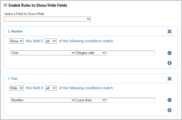
Enable Rules to Show/Hide Fields
This rule allows you to configure fields to be either hidden or shown based on specific criteria that is configured. Enable this option to show or hide fields on the form based on the value of another fields. Useful for displaying different set of fields based on user choices.
Step 1: Once this rule is enabled, you must first select a field from the dropdown to create the condition.
Note: Multiple conditions may be added for each field.
Step 2: Select whether to Hide or Show the field.
Step 3: Next choose if All or Any the following conditions must be met.
Step 4: Choose the index field to create the condition for.
Step 5: Select the operator for the rule (Greater than, is, Contains, etc.).
Note: Depending on the index field datatype, the condition operators will differ.
Step 6: Finally select the condition to be matched for the rule.
Step 7: Continue adding rules as desired. Add new conditions to the same index field by selecting the + under the last condition for that field OR select new Index fields to add new rules and conditions.
Enable Rules to Skip Pages
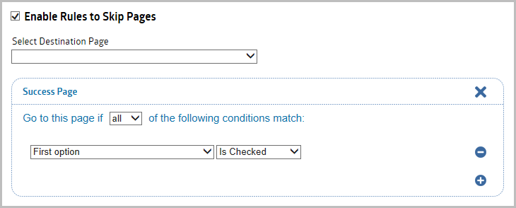
If you have a multipage form, you may add this rule to allow the form to automatically skip pages based on the condition specified. Enable this option to allow users to jump into the success page or go to any specific page based on their choices. Useful when you have multipage form and need to display different set of pages based on user choices.
Step 1: Once this rule is enabled, you must first select a Destination Page from the dropdown to create the condition for.
Note: Multiple conditions may be added for each field.
Step 2: Next choose if All or Any of the following conditions must be met.
Step 3: Choose the index field to create the condition for.
Step 4: Select the operator for the rule (Greater than, is, Contains, etc.).
Note: Depending on the index field datatype, the condition operators will differ.
Step 5: Finally select the condition to be matched for the rule.
Step 6: Continue adding rules as desired. Add new conditions to the same index field by selecting the + under the last condition for that field OR select new Index fields to add new rules and conditions.
Enable Rules to Send Notification Emails
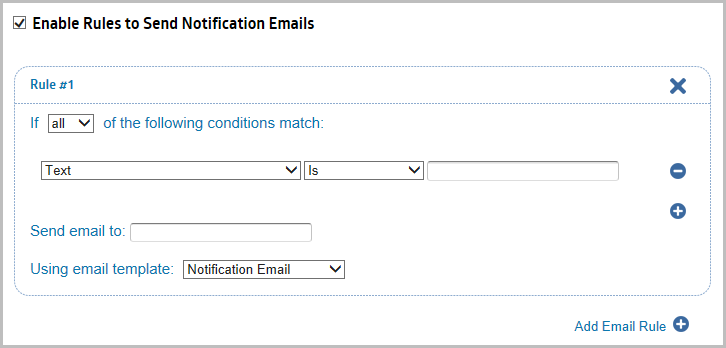
Notifications may be configured to send emails once specific conditions are met. Using this condition does NOT require the Notification Settings to be configured. This setting differs as it is will not send an email until the conditions are met. Enable this option to send additional notification emails to any email address based on user choices. You can customize the email content, subject, and from address based on user choices.
Important Note: Email server configurations are made in the database within the AppSettings table.
Step 1: Choose if All or Any of the following conditions must be met.
Note: Multiple rules may be added.
Step 2: Choose the index field to create the condition for.
Step 3: Select the operator for the rule (Greater than, is, Contains, etc.)
Note: Depending on the index field datatype, the condition operators will differ.
Step 4: Next, select the condition to be matched for the rule.
Step 5: Enter the email address where the notification will be sent once the rule conditions are met.
Step 6: Next choose the type of email template to use to send the email.
> The Notifications Email option will use the configurations that have been made in the Notifications Settings screen under the Notifications section.
> The Confirmation Email option will use the configurations that have been made in the Notifications Settings screen under the Confirmations section.
Note: An email index field must be added to the form for the Confirmation Email to be configured.
> The Custom template option opens additional fields on the screen to configure:
– From Name – Choose ILINX, Index field, or Set Custom Name which opens another field to enter a different name.
– Reply-To Email – Choose the default no-reply email or enter a custom email address.
– From Email – Enter the Email address to send the email from.
– Bcc – Add any additional email addresses to be sent when the conditions are met.
– Email Subject – Leave default {form_name} [#{entry_no}] or enter new options.
– Email Content – Leave default {entry_data} or enter new content.
– Select the checkbox to send the email in Plain Text Format.
– Select the checkbox to attach a copy of the form data in PDF file format.
Step 7: Continue adding rules as desired. Add new conditions to the same index field by selecting the + under the last condition for that Rule OR select new Email Rules and conditions by selecting the Add Email Rule.
Enable Rules to Send Form Data to Another Website
The data captured within the form may be sent to another site once specific conditions are met. Using this condition does not require the Notification Settings to be configured. This setting differs as it is will not send the data until the conditions are met. This is ADVANCED option. Enable this option to send additional webhooks to any other URLs based on user choices.
Step 1: Choose if All or Any of the following conditions must be met.
Note: Multiple rules may be added.
Step 2: Choose the index field to create the condition for.
Step 3: Select the operator for the rule (Greater than, is, Contains, etc.).
Note: Depending on the index field datatype, the condition operators will differ.
Step 4: Next, select the condition to be matched for the rule.
Step 5: Enter the URL where the form data will be sent once the rule conditions are met.
Step 6: Next choose the settings that will be used to access and send the form data to.
> HTTP Method – Choose HTTP POST, HTTP GET, or HTTP PUT.
> Use HTTP Authentication – Selecting this setting requires you to enter a User Name and Password.
> Use Custom HTTP Headers – Enabling this option opens a box to enter custom header formatting.
> Data Format – Select either Send Key-Value Pairs or Send Raw Data.
– Send Key – Value Pairs enables parameters to include the information to be added to the website. Additional Parameters may be added using the + at the bottom of the list.
• Name -> You can type any parameter name you prefer here.
• Value -> Should be the merge tag of the field you would like to send. Such as {element_1} or {element_2} etc. You can also enter any static value.
– Send Raw Data opens a multirow box to enter data as desired. Enter any content you would like to send here. You can use any data format (e.g. JSON, XML or raw text). Just make sure to set the proper ‘Content-Type’ HTTP header as well.
Step 7: Add new conditions to the same index field by selecting the + under the last index field for that Rule OR add new rules and conditions by selecting the Add Webhook Rule.
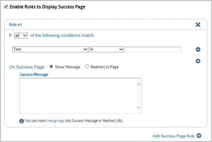
Enable Rules to Display Success Page
A success page may be displayed once specific conditions are met. This option can display a success message or redirect to a different page as designated. Enable this option to display custom success page or redirect to any custom URL based on user choices. This will override your default form success page.
Step 1: Choose if All or Any of the following conditions must be met.
Note: Multiple rules may be added.
Step 2: Choose the index field to create the condition for.
Step 3: Select the operator for the rule (Greater than, is, Contains, etc.).
Note: Depending on the index field datatype, the condition operators will differ.
Step 4: Next, select the condition to be matched for the rule.
Step 5: Select how the Success page will be displayed:
> Show Message – Selecting this option will open a message box that you may add a custom message.
> Redirect to Page – Selecting this option opens a field to enter the Redirect URL for the Success page.
Step 6: Add new conditions to the same index field by selecting the + under the last index field for that Rule OR add new rules and conditions by selecting the Add Success Page Rule.
Payment Settings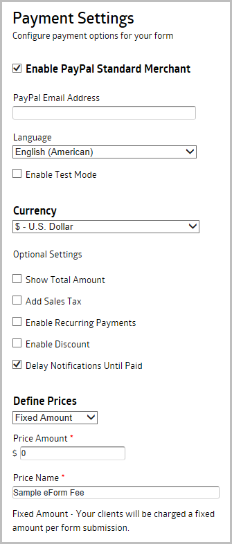
Payment Settings may be added to your form. Select the Enable Merchant checkbox to continue configuring accepting payment options.
Step 1: Select the Enable PayPal Standard Merchant You can use any kind of PayPal accounts, either Personal, Premier or Business account. A merchant will process transactions on your form and authorize the payments.
Step 2: Enter the PayPal Email Address that is associated with your PayPal account.
Step 3: Select the Language to be displayed on PayPal pages.
Step 4: Before going live with your form, it’s always a great idea to test the payment functionality of your form. Using the Test Mode, you can do this easily. If you are using PayPal, all transactions will go through PayPal test server (Sandbox). You can use this to test payments without using actual money. To access PayPal Sandbox, sign up for an account at https://developer.paypal.com.
Step 5: Select the currency you would like to use to accept the payment from your clients.
Step 6: Other Settings:
> Show Total Amount – If you have multiple prices or the total payment depends on the user’s selection, it’s a good idea to display the current total payment within the form. Simply check the “Show Total Amount” option to enable this feature. This way, your client will know exactly how much they will pay as they are filling out the form. You have the option of displaying this at the Top, Bottom, or both.
> Add Sales Tax – Enter the Tax Rate percentage to be used. Upon checkout, sales tax will automatically be added to the order total.
> Enable Recurring Payments – Select when to make the reoccurring charge Days, Weeks, Months, or Years and how many of each up to 10. If enabled, your clients will be charged automatically for every period of time.
– When enabling Recurring payments, you will have the option to enable Trial Periods. Here you will select the period of time the trial is allowed and if there is a cost associated with this Trial. You can enable trial periods to let your clients to try your subscription service before their regular subscription begin. You can set the price and duration of trial periods independently of the regular subscription price and billing cycle. Enter ‘0’ to offer free trial.
> Enable Discount – Allows your client to enter coupon code and receive discount. You may select a variety of discount methods to add to the payment options which include:
– Percent Off – Enter the discount percent amount.
– Amount Off – Enter a specific dollar amount to be discounted.
– Coupon Code – Add a code the user may enter to apply the discount indicated. Coupon codes are case insensitive. Use commas to separate multiple coupon codes.
– Select Coupon Code Field – Select the field on your form to be used as the coupon code field. The field type must be ‘Single Line Text’. If your form doesn’t have it, you need to add it first. This also includes the Max Redemptions number and when the coupon code will expire.
> Delay Notifications Until Paid – By default, notification emails are being sent when payment is made successfully. If you disable this option (not recommended), notification emails are being sent immediately upon form submission, regardless of payment status.
Step 7: Finally select whether you will charge a Fixed-Amount or Variable-Amount in Define Prices.
> When you set the form to charge a Fixed-Amount Payment, your clients will be charged a fixed amount per form submitted. Enter the amount to be charged to your client. Your client will not be able to select or change the payment amount. Enter a descriptive name for the price. This will be displayed into payment pages and the receipt email being sent to your client.
> To charge your clients variable amounts, you can use the Variable-Amount Payment. Using this payment type, you can assign prices in the Drop Down field, Checkboxes, Multiple Choice or Price fields. The Price field allows your client to enter any amount of payment. This is useful for donation forms. Add one or more field from this list to set the prices. A field can have one or more prices, depends on the type. When your client select any of the field you’ve set here, he will be charged the amount being assigned for the selected field. Supported fields: Checkboxes, Drop Down, Multiple Choice, Price.
Disable
Select the form you want to disable and select the Disable button. A message box will open asking you to enter the message you want users to see when trying to open the form. Selecting Yes will close the message box and cross out the eForm Name which indicate it is disabled. Selecting the form again will change the Disable button to Enable. This allows you to not have your form available however still save the configurations in the database.
Delete
Select the form you want to delete and select the Delete button. A confirmation message box will open to ensure the action is not accidental. Selecting Yes will delete the form from the database and will not be able to be recovered.
Duplicate
Select the form you want to have duplicated and select the Duplicate button. This will create an exact copy of the original form where you will are able to make modifications as desired.
Permissions
There are different permissions to apply depending on which where the eForm will be used within the workflow, within a View, or during the initial capture.
Initial Capture
Use the following steps to apply permissions for the user to use the eForm while capturing a document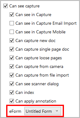
Step 1: Under the Admin tab, select Permissions in the navigation panel.
Step 2: Add the user group to the appropriate Batch Profile.
Note: See the ILINX Capture Administrators Guide for step by step instructions.
Step 3: Enable the Can see capture
Step 4: Select the eForm from the dropdown list of available eForms.
Step 5: Click Save to ensure the settings are applied.
Important Note: Any permissions applied to the Batch Index field settings within this screen will NOT apply to the eForm. Hidden or Required permissions must be applied to each field when building the eForm.
View
Use the following steps to apply permissions for the user to use the eForm within Views.
Step 1: Under the Admin tab, select Views in the navigation panel.
Step 2: When creating a View, select the checkbox next to Associated Batch Profile has eForms enabled.
Step 3: The eForm that is displayed will be determined by the batch profile of the specific row in the view results.
Note: If a batch profile has multiple eForms configured, the user may be prompted to select the desired eForm to use.
Workflow
Use the following steps to apply permissions for the user to use the eForm within the workflow.
Step 1: Within your workflow, add a Human Activity IXM.
Step 2: Select the ellipsis button to open the permissions configurations.
Step 3: Add the User Group to apply the permissions for.
Step 4: Under the User Group Permission section, select the eForm from the dropdown list that you would like to use within this Human Activity queue.
Important Note: Any permissions applied to the Batch Index field settings within this screen will NOT apply to the eForm. Hidden/Visible or Required/Read Only permissions must be applied to each field when building the eForm.
Release
ILINX Release may be configured within your workflow to send the completed eForm and associated information to your repository. Any metadata that you want associated to the eForm and content as index data must have a Batch Index field created within the ILINX Capture Batch Profile. An eForm field must then be mapped to the Batch Index field to save it in the database so it can be released. The form must be exported as a PDF using the Create eForm Output IXM. When all workflow processing is competed and you are ready to release your eForm and any supporting documents to your select repository, use the following steps to configure your workflow to release ILINX eForms.
Step 1: Add the Create eForm Output IXM to the flowcart of your workflow.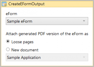
Step 2: Double click to view the IXM configurations.
Step 3: From the eForm dropdown list, select the desired form that you would like to Release.
Step 4: Choose whether to attach the generated PDF to the batch as Loose pages or as a New document.
Step 5: If New document is selected, ensure the desired Doc Type is selected from the dropdown list below the option.
Step 6: Next add a Release IXM to the flowchart of your workflow.
Note: For detailed configurations of ILINX Release, please refer to the ILINX Release Guide.
Step 7: Configure ILINX Release as desired. Map the index fields in your repository from Batch Profile Index fields that were used to store your eForms metadata values.
Other Options
Alternative Guidelines Position
Normally when you add guidelines into a field, it will be displayed on the right side of the field. It looks nice and works great on most cases. However, one drawback with this approach is obviously the space. It takes lot of space. If you really need to save some space, a solution for this is by displaying the guidelines below the field.
Simply edit your form using the Form Builder and click your field to display the field property. Then put the class name guidelines_bottom into the Custom CSS Class property.
Form Columns
There are several Built-in Classes to allow you create more advanced layout of your form fields, such as two fields on a row, three fields on a row and so on. Up to six fields on a row.
Below is the list of the Built-in Classes:
> column_2
> column_3
> column_4
> column_5
> column_6
Using Built-in Classes
You only need to add the class to the fields you would like to align. Simply edit your form using the Form Builder and click your field to display the field property. Then put the class name into the Custom CSS Class property.
For example, let say we have two text fields as below:
To align those fields into a line (which in turns create 2 columns within a row), edit each field and add column_2 class.
Save your form and the result is:
Now if you need to create more columns, you can use the other class names and make sure to assign the same class name into the fields you would like to align into one row.
Important Notes
As you can see, the Built-in Classes are very handy to align your fields into a line. You can create multiple columns within a form, each row having its own column size.
However, there are some exceptions with the field alignment class. It won’t work on Matrix Choice and Section Break field. Also, these only work if you are using the default alignment for the field labels (Top Aligned). If you are using Left or Right Label Alignment for your fields, this won’t work.
